Unmasking Your Ads: The Crucial Role of Safe Zones & Aspect Ratios in Paid Media
You've poured hours into crafting the perfect ad creative: stunning visuals, compelling copy, a clear call to action. It looks flawless in your design software. But once it goes live on Meta or TikTok, is your audience actually seeing your message? Or is your brand logo hidden behind a profile icon, or your crucial CTA button obscured by a "Shop Now" overlay?
This is the silent saboteur of many ad campaigns: the often-overlooked complexity of aspect ratios and safe zones. In the fast-scrolling, visually rich environments of social media, understanding and optimizing for these seemingly technical details is no longer optional – it's crucial for maximizing ad engagement, boosting your Click-Through Rates (CTRs), and ultimately, lowering your Cost Per Mille (CPM). At Pennock, we've seen firsthand how mastering these nuances can be the difference between an ad that performs and one that gets lost in the digital ether. In fact, safe zones have become one of the biggest talking points with our clients heading into 2025.
Understanding the Fundamentals: Aspect Ratios vs. Safe Zones
Before we dive into the specifics, let's clarify these two critical concepts:
1. What is an Aspect Ratio?
At its most basic, an aspect ratio is the proportional relationship between an image's width and its height. It's usually expressed as two numbers separated by a colon (e.g., 1:1, 9:16, 16:9).
1:1 (Square): A classic. Equal width and height. Versatile across many placements but doesn't fill the mobile screen vertically.
4:5 (Vertical/Portrait): Taller than it is wide. Optimized for vertical scrolling feeds on mobile devices, taking up more screen real estate than a square.
9:16 (Full Vertical): The full-screen vertical format, perfect for Stories, Reels, and TikTok. It fills the entire mobile screen.

Make it stand out
Whatever it is, the way you tell your story online can make all the difference.
Why it matters: Choosing the correct aspect ratio ensures your ad fits optimally into different placements, maximizing its visual impact and screen real estate.
2. What is a Safe Zone?
A safe zone is a specific, often invisible, area within your ad's canvas where all crucial creative elements – such as primary text, logos, key product shots, faces, and Call to Action (CTA) buttons – should be placed. These zones exist to prevent your critical information from being obscured by native user interface (UI) features of the platform. Think of them as "no-fly zones" for essential content.
Why it matters: Even if you have the perfect aspect ratio, if your logo is where the user's profile picture appears, or your CTA is under the "Like" button, your message is lost. Safe zones ensure your brand messaging and action points are always visible and actionable.
The Importance: Why These Details Drive ROI
Getting aspect ratios and safe zones right isn't just about aesthetics; it directly impacts your ad performance and ultimately, your Return on Investment (ROI):
Preventing Obscurity & Lost Messaging: This is the most direct impact. An ad's effectiveness plummets if its key elements are hidden. If a user can't see your brand name, product, or the button to click, your ad simply won't work.
Maximizing Engagement (CTR, Shares, Saves): Unobstructed ads are more visually appealing, easier to comprehend, and more likely to be acted upon. When users can clearly see and understand your message, they're more likely to engage, which leads to higher CTRs, shares, saves, and comments. This improved engagement signals positive user experience to the platform's algorithms.
Lowering Costs (CPM, CPC): Ad platforms (like Meta and TikTok) reward engaging content. Ads with higher CTRs and positive engagement signals are deemed more relevant and user-friendly. This often translates to better ad relevance scores, which can significantly lower your CPM (Cost Per Mille) and CPC (Cost Per Click) over time. In essence, the algorithm rewards your precision.
Protecting Brand Image & Professionalism: A poorly formatted, pixelated, or visibly cut-off ad looks unprofessional and can detract from your brand's credibility. Consistently well-formatted ads build trust and reinforce a strong brand image.
Cross-Platform Adaptability: By designing with safe zones in mind, your content becomes more adaptable. A creative planned for the strict 9:16 safe zones on Instagram Stories can often perform adequately in other placements that might re-crop or have fewer overlays, reducing the need for countless creative variations.
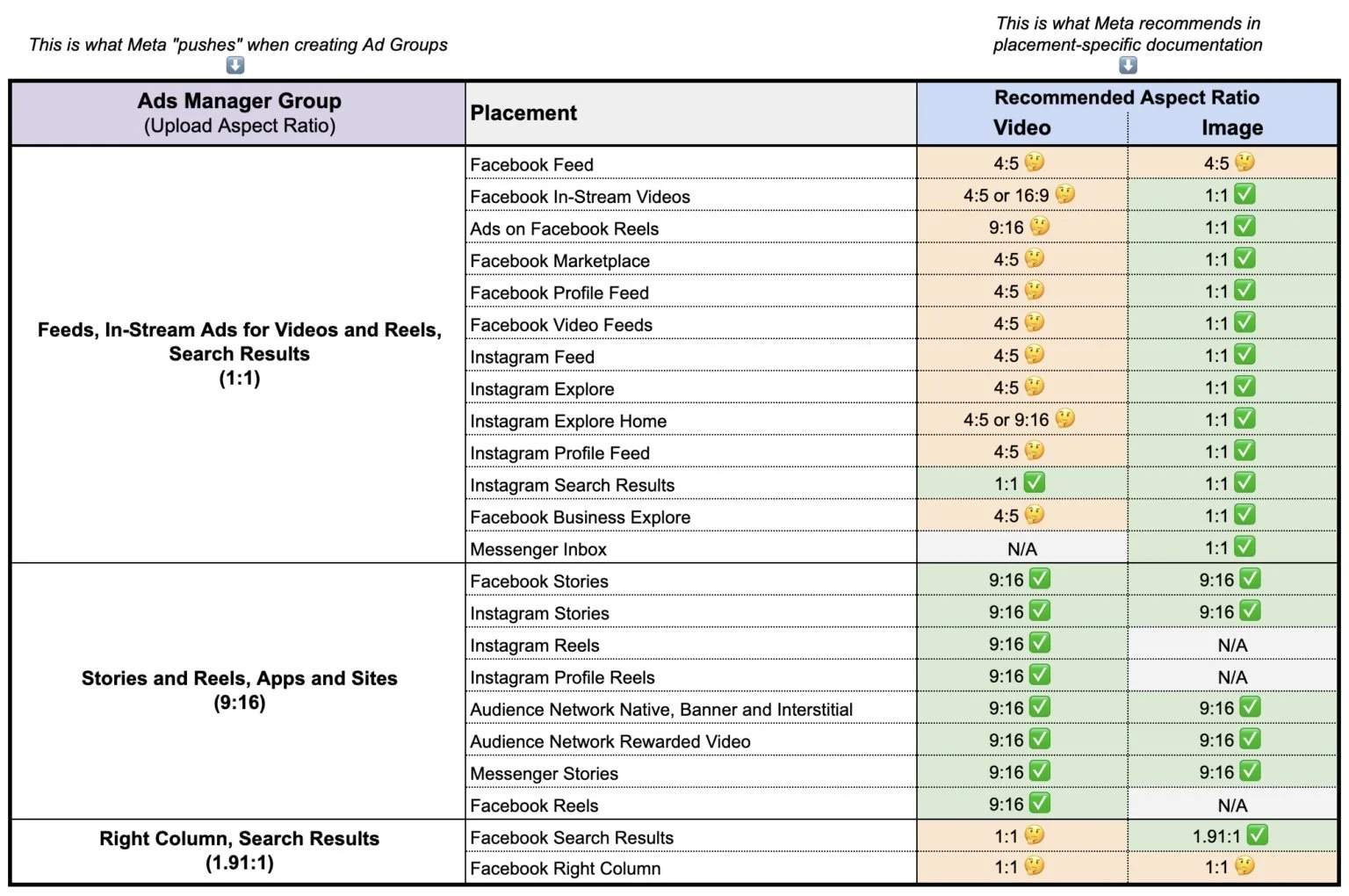
Navigating Platform Specifics: Meta (Facebook & Instagram)
Meta's ad ecosystem is vast, covering Facebook Feeds, Instagram Feeds, Stories, Reels, Audience Network, and more. While many placements are flexible, Stories and Reels have the most aggressive UI overlays.
Common Aspect Ratios for Meta Ads:
1:1 (Square): Highly versatile for feed ads across Facebook and Instagram. Maximum dimensions are often 1080x1080px.
4:5 (Vertical/Portrait): Ideal for vertical scrolling feeds on mobile (e.g., Facebook/Instagram Feeds). Takes up more screen real estate than 1:1. Maximum dimensions usually around 1080x1350px.
9:16 (Full Vertical): The standard for Instagram Stories and Reels. Fills the entire mobile screen. Dimensions typically 1080x1920px.
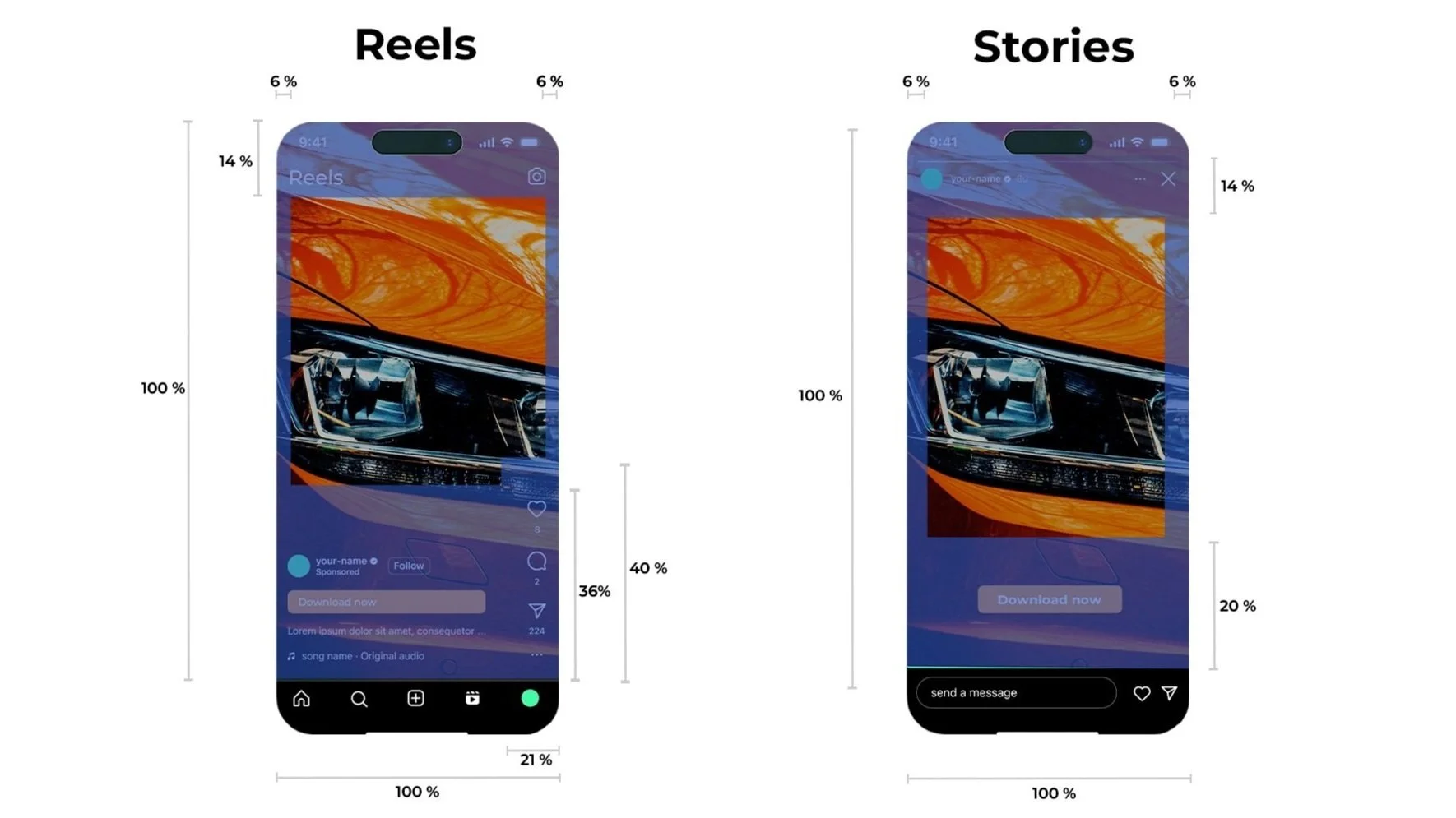
Safe Zones by Placement (Crucial for Instagram Stories & Reels - 9:16):
When designing for a 9:16 canvas, imagine these "exclusion zones" where essential content should not go:
Top Zone: Avoid placing crucial text or logos in the top approximately 14% of the screen. This area is typically covered by the user's profile icon, username, and story controls (e.g., "X" button, mute button).
Bottom Zone: Avoid the bottom approximately 20-25% of the screen. This area is where the Call to Action (CTA) button ("Shop Now," "Learn More"), account name, and engagement icons (like, comment, share) are displayed.
Side Zones: While less pronounced than top/bottom, ensure content isn't too close to the edges, as different phone models or minor platform variations can cause slight cropping.
Practical Tips for Meta:
Design for the Toughest Placement: If your ad is running on Stories/Reels, design all your creatives (even 4:5 or 1:1) with the 9:16 safe zones in mind. This means keeping critical elements within a central "safe box" that avoids those top and bottom overlays.
Use Meta's Creative Hub or Ads Manager Previews: Always upload your creative and use the built-in preview tools to see exactly how your ad will appear across different placements and devices.
Leverage Dynamic Creative: Meta's DCO can adapt elements, but the base creative still needs to respect safe zones.
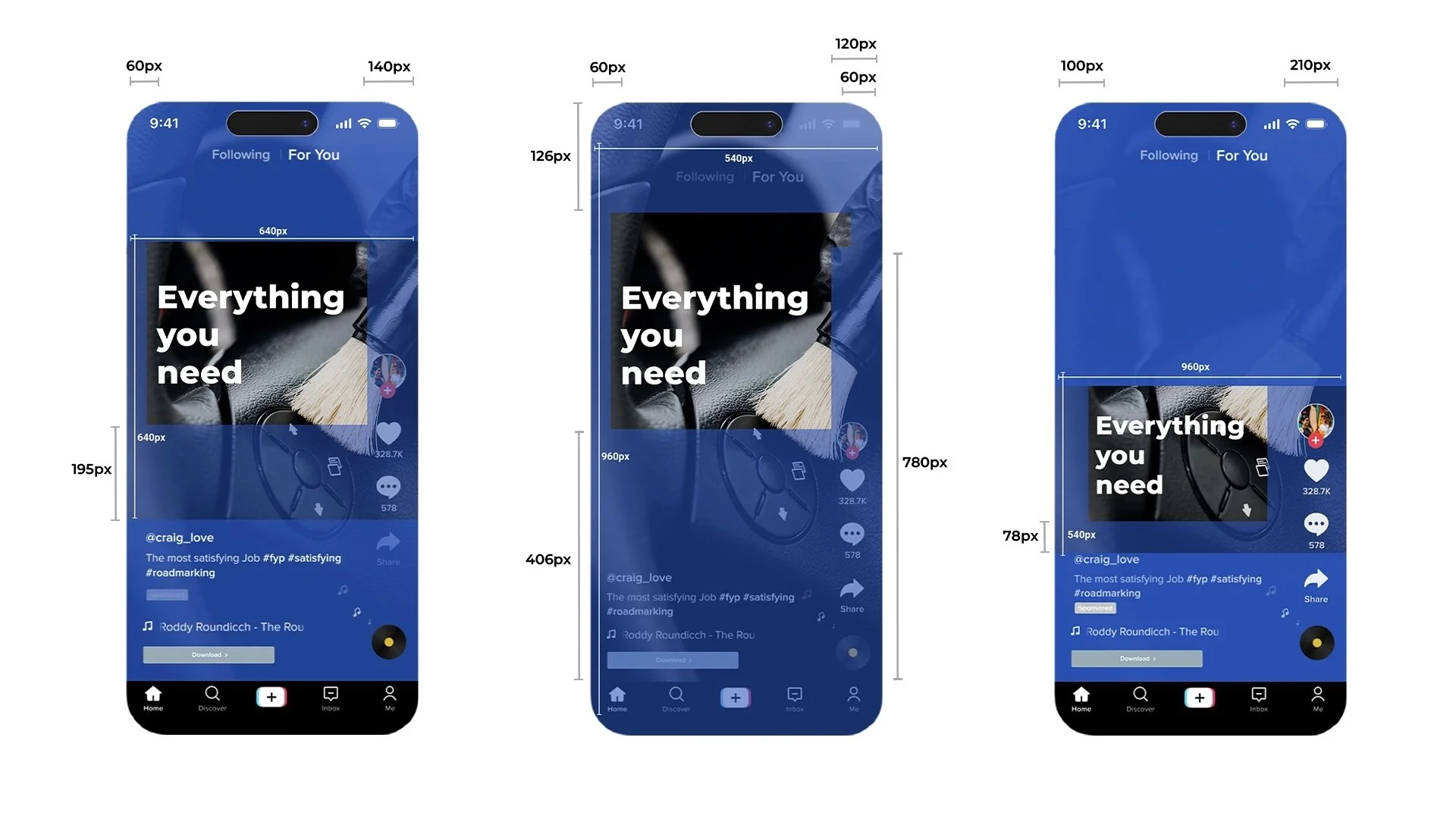
Navigating Platform Specifics: TikTok
TikTok is almost exclusively a full-screen vertical experience, making 9:16 the dominant aspect ratio. However, its interface overlays are arguably the most aggressive.
Common Aspect Ratio for TikTok Ads:
9:16 (Full Vertical): The standard. Dimensions typically 1080x1920px. While other ratios are sometimes accepted, 9:16 is strongly preferred for native integration.
Safe Zones for TikTok:
TikTok's user interface is packed with elements, significantly reducing the "safe" area for your core message:
Top Zone: Avoid approximately 15% from the top. This area is for the user's profile name, follow button, and a preview of the caption.
Bottom Zone: Avoid approximately 30-35% from the bottom. This is a large area covering the music info, likes/comments/shares icons, and the crucial CTA button.
Right Side: Avoid approximately 15-20% from the right. This column houses the profile picture, follow icon, and like/comment/share icons.
Practical Tips for TikTok:
The "Pillar" Rule: Imagine a central vertical "pillar" of content where all essential text, logos, and focal points must reside, respecting the very aggressive top, bottom, and right overlays.
Embrace Native TikTok Elements: Use TikTok's in-app text overlays and stickers within the safe zones rather than hard-coded text in your video editor. This text is typically dynamic and designed to avoid interface clashes.
Sound is Essential: While not directly related to safe zones, TikTok is a sound-on platform. Ensure audio complements your visual message, especially given visual limitations.
Preview Religiously: Always use TikTok's ad preview tools to check how your ad looks on a real device.
Test, Test, Test: Different creative concepts will respond differently to the safe zone challenge. Continuously test to see what performs best.
The Collaborative Fix: Pennock's Approach to Flawless Ads
The complexity of aspect ratios and safe zones increases when you consider how primary placements (Stories, Reels, In-Feed) interact with other placements (video feed, Explore, search, etc.) and then expand to other platforms like YouTube Shorts and TikTok. This is why a strong "safe zone strategy" is key.
At Pennock, we believe that optimizing for safe zones isn't just the media buyer's job; it requires clear, consistent communication and collaboration between:
Media Buyer: Understanding platform specifics, interpreting performance data related to creative visibility, and informing the creative brief.
Creative Team: Designing with safe zones in mind from conception, actively using templates, and verifying output.
Client: Understanding the strategic rationale behind specific creative choices, especially when a more "raw" or "centralized" aesthetic is required.
Our approach ensures:
Expert Guidance: We provide clear, up-to-date guidance on platform nuances, helping creative teams design for optimal visibility.
Strategic Creative Briefs: We translate performance goals into actionable creative requirements, including explicit safe zone guidelines.
Performance Monitoring: We rigorously track metrics to identify if creative might be underperforming due to visual obstruction, allowing for rapid adjustments.
Optimizing for ROAS: By ensuring your ads are seen and understood, we maximize engagement, which helps the algorithm lower costs (CPM) and drives higher conversion rates.
Don't let unseen interface elements sabotage your ad spend. Partner with Pennock to ensure your ads are not just beautiful, but strategically visible and highly performant.
Free Paid Ads Audit
Running paid social for a beauty or DTC brand? We'll audit your Meta and TikTok setup for free — creative, targeting, destinations, and where you're leaking spend — and send back the three highest-impact fixes. No pitch, no fluff.
Get your free paid ads audit →