DTC Landing Page Anatomy: The 7 Elements That Convert
After working with DTC businesses on hundred’s of PDPs and custom Ad Landing Pages, we’ve found success really boils down to 7 elements. We’ll break the elements into sections:
The Opener (Elements 1-3)
The Offer (Elements 4-5)
The Proof (Elements 6-7)
The Opener: First Impressions Matter
Let's start with what makes or breaks a page in the first five seconds. No pressure!!
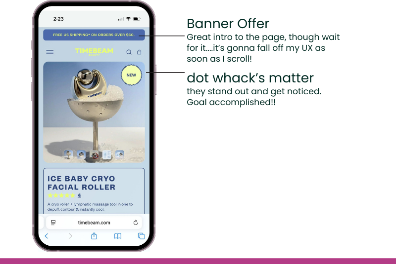
1.The Hero Section
TIMEBEAM's new product page for their Ice Baby Cryo Facial Roller plays it safe. We get a shipping banner and a 'new' tag, but there's no real emotional hook. It’s a standard product page, not a story.
What separates a decent hero from a great one? Layering the message. Think of it like a formula:
Start with the benefit. Don't sell the roller, sell the result: a depuffed, contoured face.
Add social proof. This is tough for a brand new product, so TIMEBEAM gets a pass.
Hit them with your differentiator. Theirs is great: "no fridge or freezer needed."
Create urgency. Give the fence-sitters a reason to act now. Limited stock, intro pricing.
Finally, give it the 5-Second Test. Seriously. Grab someone, show them the page for five seconds, then hide it. Ask what the product does and why it's special. If they give you a blank stare, it's back to the drawing board.
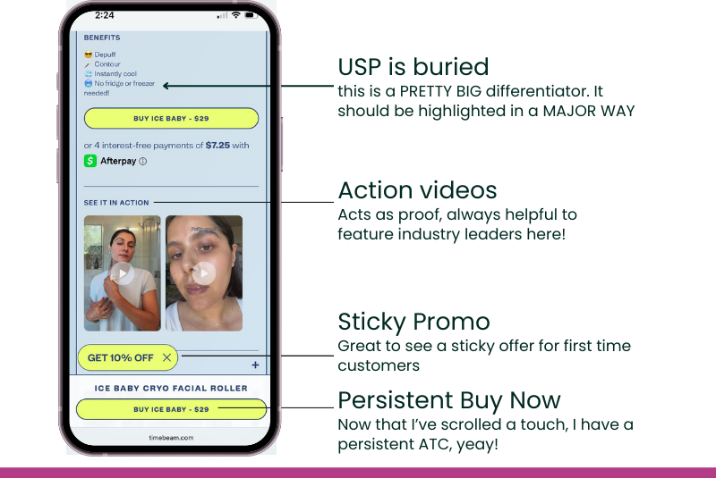
2. The Benefit Layering
Our rule for product pages is simple: make the benefits impossible to ignore.
On this page, they're a bit subtle. We get a decent four-bullet list, but it's tucked away below the mobile scroll. A bolder, in-your-face section would make the value scannable and undeniable.
This page packs a punch with video (and well optimized video, this page loads exceptionally fast). We see multiple benefit-focused videos. Smart. Most people would rather watch than read, so this is a major win.
As we scroll, a sticky offer and a persistent "Add to Cart" button appear. These aren't just 'helpful'—they're essential for driving conversion.

3. Selling the Lifestyle
Just when you think they're done with the hard sell, TIMEBEAM switches from benefits to lifestyle. This isn't a counterintuitive move; it's a pro move.
They use a series of short, clean videos where every detail is deliberate:
The setting is the aspiration. That clean, minimal bathroom isn't just a backdrop; it's the vibe the customer is buying into.
They're built for modern users. The videos are short, simple, and work with the sound off. No fluff, no friction.
The goal is integration. They aren't just showing how the product works; they're showing the customer how seamlessly it fits into their ideal morning routine.
Our rule for lifestyle content is simple: it must sell a feeling, not just a feature. Your footage shouldn't just show a product in use. It needs to show your customer the person they want to become, and how easily your product gets them there.
The Offer: Making The Sale

4. The Strategic Upsell
Placing an upsell before you've even finished detailing the main product might seem backwards. But it's a savvy AOV play.
Most brands hide upsells at the bottom of the page like an afterthought. TIMEBEAM introduces their "longevity" routine early, showing what this roller pairs with. It reframes the purchase from a single item into part of a larger system. They use sharp, aspirational imagery that makes you want the entire collection, not just the one tool.
5. Always-On CTAs
So you’ve made it past the 5-second mark. Whoop! That means the page opener did its job.
Even better, you’ve been able to add the product to your cart at any point in the journey. This isn't a minor detail. My rule is that you should never make a customer hunt for the 'buy' button. A persistent, sticky CTA reduces friction and ensures the path to purchase is always just one click away.
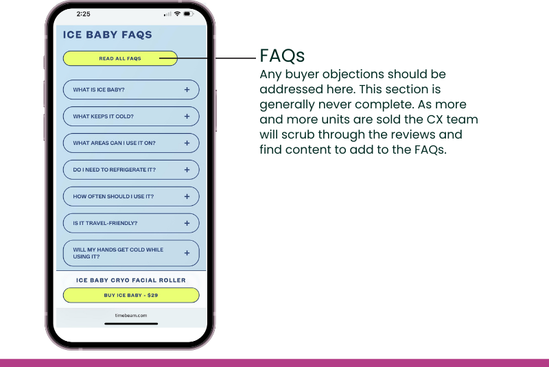
6. Overcoming Objections
Finally, we hit the FAQ section. Many brands treat this as an afterthought, but it's your last, best chance to crush any lingering doubt.
Think of your FAQ as an objection-handling machine. This is where you proactively address every "what if?" that's stopping a customer from converting.
And if you have a killer return policy or a money-back guarantee, don't you dare hide it on some other page. This is the perfect place to feature it prominently. You aren't just answering questions here; you're removing every last shred of risk from the purchase.

7. The Proof
What’s a product page without reviews? That’s one A/B test I'm not brave enough to run.
Social proof is non-negotiable.
The Bottom Line
Think of your landing page as a conversation with a smart, interested skeptic. Your job is to win them over.
To do that, your page absolutely must:
Quickly prove your value.
Proactively crush their objections.
Build enough trust to earn the click.
It sounds simple because, with this framework, it is.